Zumy
Just in time for peak remote-work, a video-chat product in need of a brilliant brand.
The universal problem with video-calling from home: bad lighting, preventing people from looking and performing their best. It’s a problem Zumy is poised to solve.
Welcome to the new normal, where so much human connection, especially business, is done over Zoom and similar platforms — usually in not-ideal conditions. Enter Zumy. A powerful, portable little light that clips to your laptop or tablet, Zumy ready to launch its product with a shiny new brand created with the help of Studio Brinks. Focusing on positivity and empowerment, Zumy’s brand debut positions the device as trusty, supportive, and above all, fun.
Logo refresh
A key priority was to take their existing logo and make it bolder and rounder to emphasize approachability and empowerment. We chose their primary brand color, yellow, for pretty obvious reasons: it's a cheerful, positive color that plays on the concept of light.
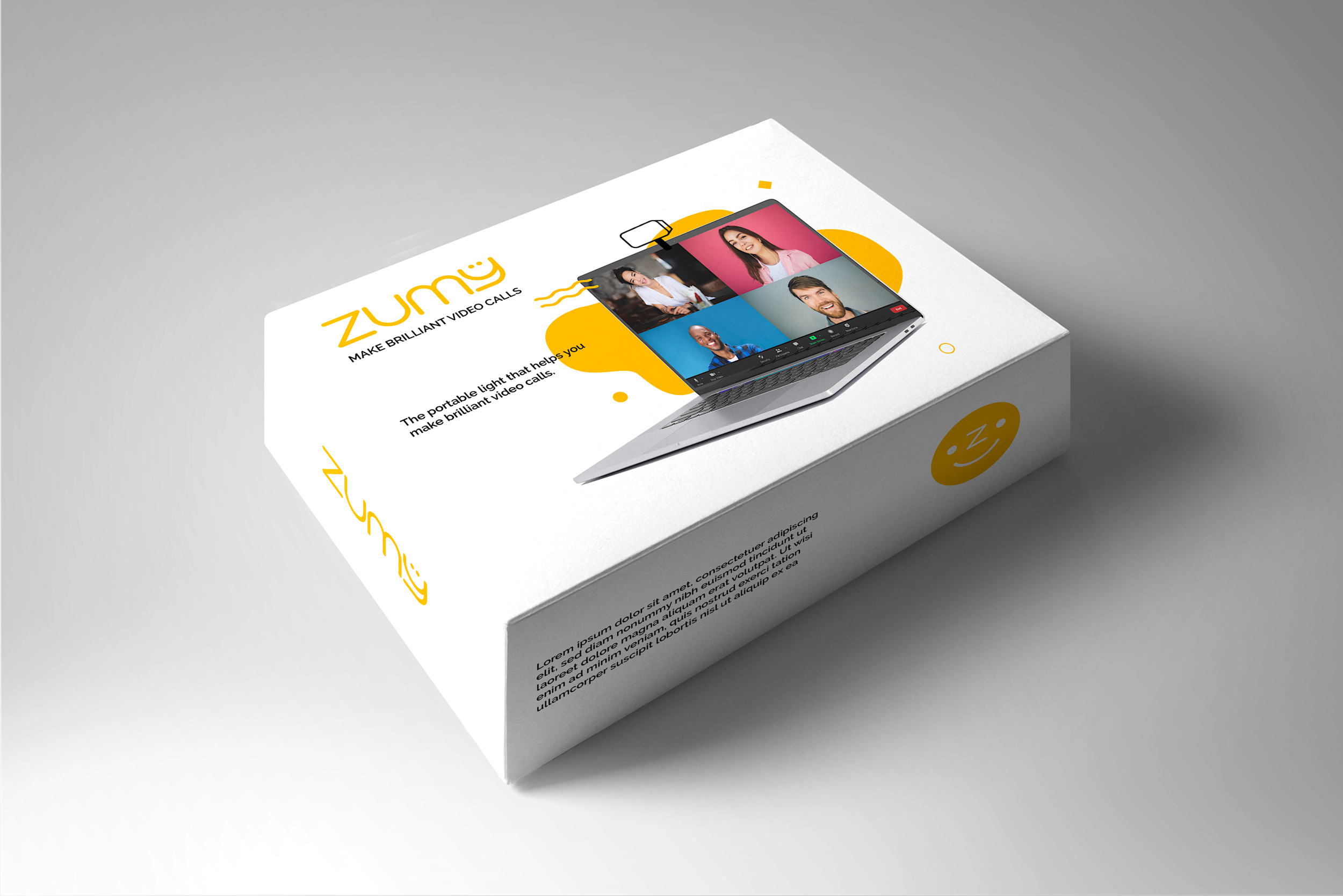
Package design, web presence and social media
Essentially look-and-feel mock-ups, these designs will set the tone for future packaging and marketing initiatives.
Ads for the educational and business sectors
Zumy wanted to hit the ground running with their launch marketing, so we wrote and designed a pair of ads that played to their main two markets.
Brand bio, messaging and brand guidelines
With our help, Zumy made the smart move of getting their brand guidelines together before their launch, enabling them to move forward with a single voice. This included the crafting of their “elevator pitch” and other “Zumy is…” messaging pieces for various uses.


