Flour + Honey
Flour & Honey sought a new brand identity to better feature their unique organic baked goods and accommodate their location in charming North Carolina.

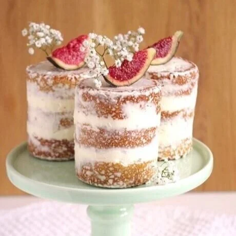
Founder Jenny Delgado had fond memories eating petit fours as a child on special occasions. Her love of baking ultimately became her dream job when she opened Flour & Honey in 2018 with the mission of positively impacting local and global communities through organic and gluten free bites that actually tastes great.
Flour & Honey’s new branding had to convey their love for small businesses, their wholesome ethos, and knowledge of healthy and tasty confections. The overall design of the brand communicates a modern farmhouse look through bright and clean backdrops, industrial fonts, and textures incorporating wild flowers.
BRAND Strategy
We began with a series of in-depth brand strategy workshops to discover what Flour & Honey meant for their audience, and what direction they wanted to move in. We started with three mood boards to start discussing visual language and start to move us into the right direction.


Jenny’s roots in California’s Sonoma wine country and farm-to-table cuisine was a major influence on the brand. In order to embody their mission, Flour & Honey needed to be laid-back, humble and friendly, just like a small town bakery should be. We quickly eliminated the feminine Parisian look of option #3 and opted for a combination of #2 and #1 - bright and artisanal with industrial elements and floral accents.


Note: This is not the final interior design. We armed Jenny with all of the branding elements she needed so that she could move into the next phase of her business and open her shop. We can’t wait to see how it turns out!
Ready to launch the brand of your dreams?