Third Reflection Salon
The brand new Walnut Creek salon needed a clean, modern identity that would appeal to a wide range of potential customers.

Third Reflection’s purpose is to be a salon worthy of Walnut Creek and its residents—a place to celebrate individuals and make them look and feel their best.
The logo needed to appeal to a wide audience. This included men and women of all ages. The minimalistic mark is both sleek and modern. The copper foiling on the business card suggests sophistication while the modern san serif is modest and approachable.


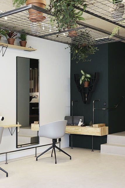
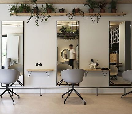
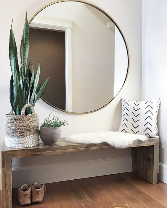
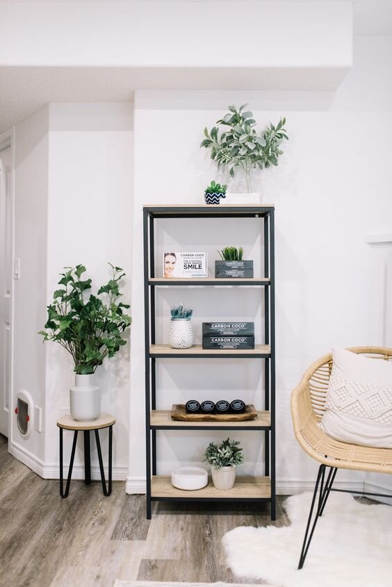
Interior Design
The owner wanted a clean and modern look that also felt inviting. The high-contrast white and green walls with modern fixtures give it a contempoary look, and the plants and natural lighting add warmth to an otherwise sterile environment. We developed this mood board, and loved the dark green so much that we made it our primary color in our palette.
Color Palette & typeface
3R’s color palette uses a dark rich and sophisticated green, and is often paired with dusty rose. We chose a rose gold metallic for her accents, including the foiling on their business cards and furniture fixtures. T


Ready to launch the brand of your dreams?